Alt Text for Images Accessibility
Images accessibility is one of the most important aspects of creating inclusive and user-friendly websites.
When pictures lack proper descriptions, many users, especially those relying on screen readers, miss essential information. Not only does it enhance accessibility for people with visual impairments, but it also benefits SEO and overall experience.
In this article, we’ll explore alt text best practices, why it matters, and how to write it effectively.
What is alt text for images?
Alt text, short for alternative text, is a written description added to a photo in HTML with the alt attribute.
Its purpose is to explain users what an image represents when they can’t see it. This could be due to visual impairments, slow internet connections, or even technical errors where files fail to load.
Think of accessibility alt text as a translator: it converts visuals into words.
Bad Alt Text:
“Image123.jpg”
Good Alt Text:
“Golden retriever puppy playing with a red ball on the grass”
Notice how the second version provides a clear mental picture, while the first is meaningless.

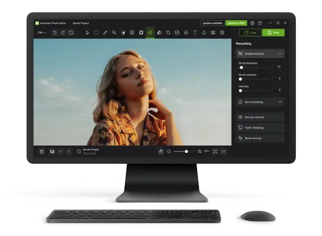
And remember—it can be helpful to refine or adjust visuals using an image editor, ensuring your content is both polished and accessible.
Why alt text matters for images accessibility?
For millions of people who rely on assistive technologies, images without descriptions are essentially invisible.
Screen readers are designed to vocalize or translate content into braille. Alt text acts as their “voice”. Without it, the software simply skips the photo, creating gaps in understanding.
Plus, alt text for images improves more than accessibility—it enhances experience for everyone. Consider situations where:
- Internet speed is slow and files fail to load.
- You are quickly scanning through the page for key information.
- An e-commerce shopper depends on product descriptions to decide before buying.
In all of these cases, descriptive text ensures clarity and smooth navigation within file.
Search engines can’t see images—they interpret them through surrounding attributes. When you provide well-written alt text, you:
- Give Google stronger context for ranking your page.
- Clarify what your pictures represent.
- Improve the chances of matching relevant search queries.
Example: “blue ceramic coffee mug on a wooden table” communicates both the product and setting, which a generic label like “mug” fails to do.
In short, alt text strengthens both accessibility and visibility—making your content more inclusive while also helping it perform better online.
Image alt text best practices
Creating alt text is both an art and a skill. It’s not about stuffing in keywords or writing long captions—it’s about providing just enough context.
How long should alt text be?
The description should highlight the most relevant detail without becoming a long caption.
Good:
“Golden retriever puppy chasing a red ball in the park.”
Weak:
“Dog.” (too vague)
Overloaded:
“Golden retriever puppy running quickly, chasing, catching, jumping, playing with bright red ball on a sunny morning in Central Park.” (excessive detail)
Aim for fewer than 125 characters, since many assistive devices cut off longer text.
Avoid turning it into keyword lists
While alt text can support search visibility, forcing keywords breaks readability and diminishes accessibility.
- Don’t: “Buy cheap mugs, ceramic mugs, coffee cups, best mugs, blue mugs online.”
- Do: “Blue ceramic coffee mug on a wooden breakfast table.”
Think of it as writing for people first, search engines second.
Know when to leave it blank
Some visuals are purely decorative - such as borders, icons, or stylistic flourishes - and don’t require explanation. In these cases, using an empty attribute prevents screen readers from announcing irrelevant items:
<img src="border-pattern.png" alt="">
Image alt text accessibility examples
| Image type | Suggested treatment |
|---|---|
| Informational photo | Point out the main subject (“Chef slicing fresh salmon”) |
| Product display | Mention defining features (“Black leather handbag with gold zipper”) |
| Decorative graphic | Leave empty (alt="") |
| Complex diagram/chart | Provide a short summary in alt, with details in nearby text |
Common mistakes to avoid
Even with the best intentions, alt text often misses the mark. Recognizing frequent errors will help you create descriptions that are genuinely helpful for accessibility in images.
Duplicating surrounding data
If a caption already explains the photo, repeating the same sentence in the alt attribute is unnecessary. Instead, use it to complement or slightly reframe the information.
- Caption: “Team celebrating launch of new app.”
- Better alt text: “Six colleagues clapping and raising glasses at the office party.”
This way, the two parts work together without redundancy.
Starting with “image of”
Screen readers announce that the element is a picture, so adding “image of” or “photo of” only creates clutter.
Skip the obvious and jump straight into the description.
Conclusion
Alt text is more than just a technical requirement—it’s a bridge that makes digital spaces more welcoming, inclusive, and functional for everyone.
By writing clear, descriptive, and purposeful description, you contribute to both accessibility and better website performance.
Whether you’re a web designer, content creator, or business owner, focusing on text in images accessibility ensures your content reaches a wider audience and delivers meaningful experiences to all users.

Expert Tech Writer
