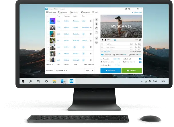
What are Some Common Slideshow Mistakes to Avoid
Whether you’re pitching an idea or delivering a keynote, your presentation can either make your message shine or sink it entirely.
If you’ve ever wondered what are some common mistakes to avoid when creating a slideshow, you’re not alone—and the good news is, most of them are quick to fix.
In this article, we’ll walk through 12 of the most frequent pitfalls and show you exactly how to turn them around fast, so your video works with you, not against you.
12 Common slideshow mistakes
1. Overloaded Text Blocks
Long paragraphs crammed into a slide compete with your spoken words and force the audience to choose between reading and listening. This overload fragments attention and reduces recall.
Remedy for the slide error: Use the principle of distillation—condense each point into short phrases or keywords. Deliver the context verbally.
Example:
Bad:
"Our company has been in operation since 1995, providing innovative solutions across multiple industries with a focus on client satisfaction and continuous improvement."
Good:
"Since 1995 > Multi-sector reach > Client-first growth"
Insider Note: Keep in-depth explanations in a handout; slides should visually prompt, not narrate in full.
2. Unnecessary Motion Effects
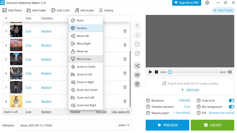
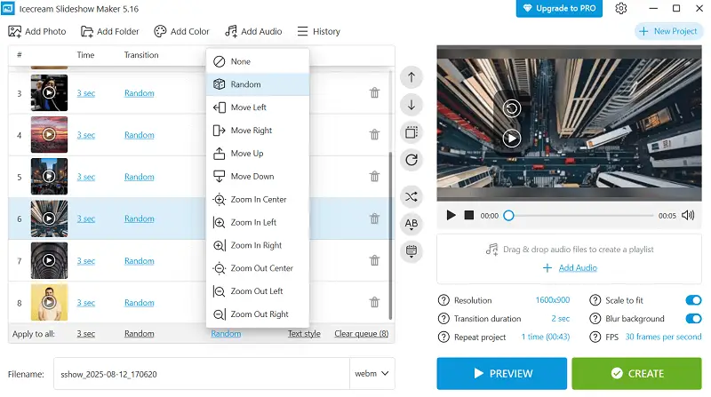
Diverse animation types and flashy transitions interrupt pacing and divert attention from your core message.
Remedy for mistakes in presentation: Limit motion to functional utilization—direct target, reveal steps, or show relationships. Maintain one subtle transition style throughout.
Example:
Fade-in for each process step rather than spinning text.
Insider Note: Overactive animations can fatigue or disorient viewers, especially in dark rooms with large screens.
3. Low-Quality Visuals
Blurry, pixelated, or distorted imagery weakens professionalism and distracts from the material.
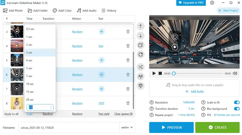
Remedy for what makes a bad presentation: Use high-resolution media (1920px+ for full-slide display) and preserve aspect ratios when resizing.
Example:
Replace a stretched logo with a sharp, scalable SVG.
Insider Note: Have a curated library of approved brand graphics to avoid last-minute compromises.
4. Chaotic Typography
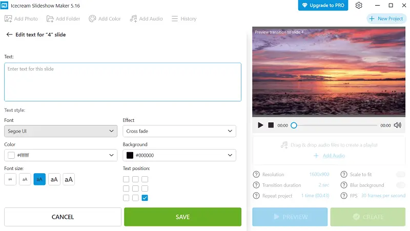
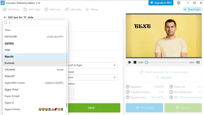
Inconsistent fonts, sizes, and spacing disrupt visual flow and make slides harder to read.
Remedy for bad slideshow: Define a type hierarchy—set letterings and scale for titles, subtitles, and body before designing.
Example:
Title: Poppins Bold 34pt. Subtitle: Poppins Regular 26pt. Body: Poppins Light 20pt.
Insider Note: Limit to one or two typefaces; sans-serif lettering are often clearer on screens.
5. Poor Contrast
Weak separation between message and background strains the eyes, especially under bright lights or on older projectors.
Remedy for presentation mistakes: Follow contrast guidelines—minimum 4.5:1 ratio for normal narrative, 3:1 for large one.
Example:
Charcoal text on pale beige instead of light gray on white.
Insider Note:
- Avoid pure red or blue for small type—projection systems render them poorly.
- Always test slides in the venue’s lighting.
- Palettes that look vibrant on a laptop may wash out on a big screen.
6. No Visual Priority
When all elements look the same, the viewers doesn’t know where to focus first.
Remedy for common slideshow mistakes: Apply hierarchy cues—size, placement, color, and spacing to signal importance.
Example:
Headline at 36pt with generous white space; secondary points at 22pt below.
Insider Note:
- Harness padding intentionally to separate concepts.
- Arrange key content according to natural eye-movement patterns (Z or F-shape).
- Stick to one dominant focal element per slide unless comparing two items directly.
7. Reading Word-for-Word
Using slides as a teleprompter diminishes presence and drains energy from your delivery.
Remedy for slide error: Design cue-based slides—keywords or visuals that prompt your talking points without spelling them out.
Example:
3 Gains: Speed | Accuracy | Efficiency > Elaborate verbally.
Insider Note:
- Viewers read faster than you speak—don’t reveal everything at once.
- Practice from notes to avoid dependency.
- Adjust pacing and temper to keep engagement.
8. Outdated Artwork
Old clip art or dated stock images instantly date a presentation and undermine credibility.
Remedy for bad slideshow: Use modern, cohesive diagrams—flat icons, minimal line art, or high-quality photos.
Example:
Swap cartoon handshake for a clean monochrome vector icon.
Insider Note:
- Hold icon style consistent (stroke weight, shape details).
- Align imagery with brand spirit.
- Employ artwork to clarify meaning, not for decoration alone.
9. Overstuffed Charts
Too many bullets, hues, and labels obscure the main takeaway.
Remedy for mistakes in presentation: Apply data decluttering—simplify visuals, limit saturation to two or three, and emphasize key trends.
Example:
Quarterly averages with the growth trend highlighted in bold color.
Insider Note:
- Remove 3D effects to avoid value distortion.
- Let secondary info recede into muted tones.
- Leverage multiple small charts for complex comparisons instead of cramming them into one.
10. Disjointed Sequence
Jumping between unrelated topics breaks narrative flow and confuses the participants.
Remedy for what not to do in a presentation: Structure a clear storyline—context, challenge, solution, evidence, and action.
Example:
Problem > Approach > Outcome > Next Steps.
Insider Note:
- Deploy divider slides to mark transitions.
- Revisit the opening premise near the end for closure.
11. Accessibility Oversights
Design choices that rely on color alone, tiny script, or uncaptioned media exclude part of the listeners.
Remedy for common slideshow mistakes: Incorporate inclusive pattern—add patterns, ensure readable font sizes, and caption videos.
Example:
Patterned fills and labels for red/green chart categories.
Insider Note:
- Provide alt text for critical visuals in digital versions.
- High-contrast layouts benefit all viewers.
- Accessibility compliance can be both a legal requirement and a brand-strengthening practice.
12. No Tech Rehearsal
Failing to test slides in the real environment risks layout shifts, missing fonts, or broken links during delivery.
Remedy for slide errors: Conduct a full technical run-through on the exact hardware and software setup.
Example:
Store videos locally to avoid streaming issues.
Insider Note:
- Keep both cloud and physical backups.
- Prepare a PDF version for emergencies—animations won’t run, but the design will hold.
- Arrive early to change resolution, audio, and lighting before attendees arrive.
Tips on how to make a slideshow
Clarify Your Goal
Establish the core purpose of your talk—whether it’s to inform, persuade, or inspire. This focus directs content development and stylistic choices.
Tailor Templates to Suit Your Theme
Adapt existing designs by customizing colors, typography, and layouts to better match your subject matter and audience preferences, ensuring greater resonance.
Employ Data Visualization
Represent numerical information through graphs, charts, and infographics that simplify complex concepts and highlight key insights without clutter.
Adjust for Various Environments
Anticipate where your slides will be shown—projectors, desktops, tablets, or smartphones—and modify resolution, aspect ratios, and text size.
Utilize Speaker Notes
Create a slideshow with detailed prompts or reminders to your presenter papers, allowing you to keep eye contact and flow.
Integrate Multimedia Elements
Include sound clips, snippets, or animations sparingly to enhance storytelling, ensuring they complement rather than distract from your core message.
Prepare Flexible Navigation Paths
Create non-linear slide structures that allow you to jump between topics easily during Q&A or interactive sessions, enhancing responsiveness.
Export in Multiple Extensions
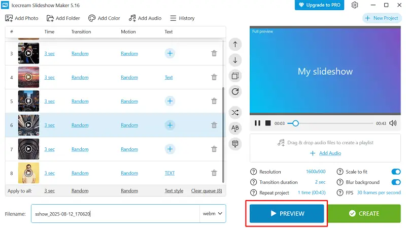
Convert your slideshow into PDF, video, or interactive web formats suited to your distribution channel.
What picture slideshow makers to choose?
| Slideshow Creator | Recommended For | Distinctive Features | Skill Level |
|---|---|---|---|
| Icecream Slideshow Maker | Quick, straightforward photo compilations | Simple drag-and-drop interface, adjustable transitions, music integration, high-definition output | Beginners |
| Microsoft PowerPoint | Professional and academic decks | Robust animation options, multimedia embedding, editable master slides, advanced layout control | Intermediate to expert |
| Google Slides | Team collaboration and virtual presentations | Cloud-based real-time co-editing, effortless sharing, version history, seamless Google ecosystem sync | Novices to intermediates |
| Canva | Visually rich branding and marketing content | Extensive template library, digital compatibility, easy-to-use design tools | Novices to intermediates |
| Adobe Express (Spark) | Story-driven, polished marketing visuals | Pre-designed themes, smooth multimodal incorporation, branding, straightforward timeline tweaking | Beginners to intermediates |
| Movavi Slideshow Maker | Creative projects featuring effects | Wide array of filters, voiceover recording, automated slideshow generation | Beginners to intermediates |
| ProShow Gold/Producer | Highly customized and legacy presentations | Detailed timeline correcting, multi-layering, keyframe control, broad export capabilities | Advanced |
Common slideshow mistakes - Conclusion
Crafting a great presentation requires both creativity and technique, greatly shaping the way your ideas resonate with viewers.
Identifying frequent slide errors allows you to swiftly elevate your work’s clarity and engagement. Applying the suggested solutions improves aesthetics, sustains attention, and strengthens your core message.

