7 Techniques to Make Slideshow Text Readable

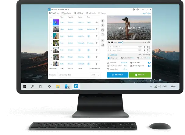
Adding text to slideshow is just the beginning of making your words pop. In a world where screens of all sizes compete for attention, your titles, fonts, and captions need to do more than look good — they have to be instantly readable, everywhere.
From eye-catching headers to descriptions that guide your audience without distraction, every detail shapes how your message lands.
In this article, we’ll dive into the strategies that present your slide text not only stylish but impossible to ignore, no matter the device.
1. Titles: Visual Anchors & Hierarchy
Lead-ins act as cognitive anchors, directing focus and clarifying slide structure. Clear slideshow headings ensures quick comprehension.
Specialized Techniques for Text Slide:
- Perceptual Weight: Larger, bolder topic lines signify importance; align with natural eye movement patterns (F or Z layout).
- Contrast Standards: Retain WCAG 4.5:1 ratio for perceptibility; high-luminance foregrounds on medium-to-dark backgrounds enhance clarity.
- Font Psychology: Sans-serif communicates modernity; serif conveys authority. Choose deliberately.
- Letter Spacing: Adjust kerning to prevent crowding, especially at larger sizes.
Example:
- Main line: "Global Market Trends 2025" (Helvetica Bold, 54 pt, Dark Blue)
- Subtitle: "Quarterly Regional Analysis" (Helvetica Medium, 36 pt, Gray, line-height 1.2)

2. Fonts: Optimized for Screen Legibility
Typeface selection impacts perception, readability, and device rendering.
Specialized Techniques for Slides Font:
- Interface Noting: Pick lettering with TrueType hinting to uphold crispness on displays with low resolution.
- Weight & Optical Size: Apply bold weights for topics, regular for paragraphs; optically sized ones improve sharpness at small dimensions.
- Proportional Scaling: Maintain consistent ratios between labels and body text to preserve hierarchy.
- Avoid Ornamentation: Decorative styles reduce comprehension for callouts or detailed content.
Example:
- Body: Inter Regular, 28 pt, line-height 1.4
- Heading: Inter Bold, 48 pt, line-height 1.2

3. On-Screen Captions: Accessibility
Footnotes clarify information, aid retention, and ensure inclusivity for viewers with hearing differences or noisy environments.
Specialized Text to Slideshow Techniques:
- Reading Duration: 2–3 seconds per line; longer ones 4–5 secs.
- Positioning: Bottom 15–20% of slides; refrain from obstructing key visuals.
- Line Segmentation: Split long sentences into short segments to improve scanning speed.
Example:
- Caption: “North America revenue increased 12% in Q2”
- Font: Arial 22 pt, white text on 60% black overlay, appears 0.3 seconds after chart animation

4. Color & Contrast: Graphic Perception
Tone influences attention, comprehension, and emotional impact. Strategic combinations enhance distinctness.
Slide in Text Specialized Techniques:
- Palette Ratios: Minimum 4.5:1 for standard text, 3:1 for large headings.
- Colorblind Considerations: Avoid red/green shades; incorporate icons or texture for clarity.
- Perceptual Emphasis: Bright text on muted dark video backgrounds draws focus; dark on light surfaces minimizes fatigue.
- Gradient Management: Employ subtle overlays or blur to prevent background interference.
Example:
- Title: “Annual Revenue Insights” in #1A1A1A over blurred gradient #E0E0E0>#FFFFFF ensures plainness and neutrality

5. Layout & Spacing: Structured Legibility
Proper placement and intervals facilitate scanning and reduce cognitive load.
Specialized Techniques for Slideshow with Text:
- Grid Alignment: Utilize a 12-column system; maintain consistent gutters and margins.
- Whitespace: Minimum 10–15% padding around elements to stay away from visual clutter.
- Eye Movement: Orient main components along natural reading paths (F or Z).
- Hierarchy Consistency: Keep heading, paragraph, and caption locations uniform across slides.
Example:
- Slide with title, chart, and graphics aligned on a 12-column grid, 15% margins; legible on projectors, tablets, and phones

6. Animation & Timing: Focused Attention
Motion guides the gaze, highlighting items while preserving comprehension.
Specialized Techniques on How to Add Text to Slideshow:
- Duration: 0.3–0.5 seconds for fades; stagger blocks sequentially.
- Concentration Funnel: Animate primary heading first, then subtitles, and descriptions.
- Perceptual Speed: Avoid fast transitions (<0.25 seconds) that hinder examining.
Example:
- Heading fades in 0.4 sec > subtitle slides up 0.35 sec > explanation appears 0.3 sec later, preserving authentic scanning order

7. Resolution Optimization
Text must remain noticeable across pixel densities and monitor sizes.
Text Slide Specialized Techniques:
- High-DPI Support: Vector-based fonts prevent blurring on Retina or 4K HD displays.
- Safe Zones: Keep key elements within 80% of slide dimensions to hinder cropping.
- Aspect Ratio Adaptation: Design for 16:9 widescreens; provide 4:3 fallback if needed.
- Responsive Previews: Test segments on multiple devices to ensure proportion.
Example:
- Title: “Sustainability Initiatives 2025” scales proportionally for panoramic and portrait tablet formats without losing transparency

What are some text features for slideshow?
| Type | Description | Tips | Example |
|---|---|---|---|
| Titles | Core phrase summarizing the slide’s message | Sustain brief (5–7 words), bold, legible | "Quarterly Sales Overview" |
| Subheadings | Supporting line adding context | Use smaller font; stay concise | "Trends from January to March" |
| Paragraphs | Core details explaining content | Break into point; avoid lengthy sentences | - Increase in online sales - Customer engagement improved - New product launches |
| Bullets | Organizes points for clarity | Limit to 3–6 items; maintain parallel phrasing | - Research findings - Marketing strategies - Performance metrics |
| Annotations | Short description for visuals | Place near image; hold succinct | "Revenue growth chart from Q1" |
| Quotes | Highlights key ideas or statements | Italics or quotation marks; subtle priority | "Customer satisfaction is our top priority." |
| Text Overlays | Vocabulary superimposed on graphics or images | Ensure contrast; use bold fonts | “Summer Sale – 50% Off!” over product image |
| References | Supplementary details or sources | Smaller font; avoid overcrowding | "Source: Company Annual Report 2025" |
| Typography | Variations in type, weight, or style | Limit to 2–3 fonts; emphasize key statements | Bold title, regular body, italics for accent |
| Spacing | Arrangement and gaps | Hold consistent margins | Centered title, left-aligned entries |
| Emphasis | Focus on important text using style or color | Apply sparingly to guide the eye | "Profit increased by 25% in Q2" |
| Animations | Entry, exit, or movement effects for text | Subtle effects; avoid distraction | Fade-in steps or slide-in titles |
Slideshow Text - Conclusion
Creating slides that truly connect with audiences depends on more than just striking visuals — it requires text that remains clear, balanced, and accessible in every context.
By applying principles of readability, contrast, and alignment, you not only make your content easier to follow but also reinforce your message with impact.
In the end, effective slide text isn’t about what’s written — it’s about how smoothly it can be absorbed, no matter the screen, format, or environment.
Expert Tech Writer
